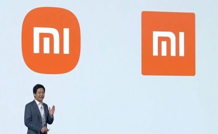
Xiaomi has unveiled its new logo which is said to disrupt the traditional rules of brand logo usage of the past. The new logo adopts a softer, rounder contour on the corners of the previously squared logo, along with redesigned “MI” typography. Its iconic brand colour orange remains to convey the liveliness and youthfulness of Xiaomi. Black and silver will also be used as supplemental colors to accommodate high-end product line applications. According to the brand, the new logo is not fixed at the four corners of the square, instead, it adapts to content and is placed at the most suitable position. The new dynamic logo further embraces the philosophical thinking, making the logo truly come “Alive”. The rebranding and “Alive” concept was done in collaboration with world-renowned designer, professor of Musashino Art University and the President of the Nippon Design Center, Kenya Hara. Xiaomi explained in a blog post that Hara used “superellipse” mathematical formula when designing the logo of Xiaomi. compared with a right-angled object, Xiaomi said a circle is a shape that is more agile, which is the perfect representation of the company’s flexibility, relentlessness and its will to move forward. The new logo was unveiled during its new product launch session which was also live-streamed on Facebook. Meanwhile, Hara explained in a separate video that through experimenting with the curve of the typography, the team arrived at a perfect font – synched with the logomark outline. It also completely redesigned the logotype to match the new look. “Using the logomark and the logotype separately is optimal. When promoting brand and services, we suggest using the logomark. The logotype, on the other hand, will look its best on Xiaomi’s high-resolution devices,” he added.